"Kioi Seido", a stunning building in Tokyo with no specific purposes
Designed by Hiroshi Naito
About me

Yasuo Nakamaru
Registered Architect and National Government Licensed Guide Interpreter.
Worked at an architectural firm for 38years and designed domestic works and overseas works in Japan, US, UK, China, etc.
Favorite Buildings: National Gallary of East Wing by I.M.Pei in the US, Kimbell Art Museum by L.Kahn in the US, 21st Century Museum of Contemporary Art by SANAA in Japan
Favorite Things: Playing bass guitar, Jazz Music
The building looks as if this is a modern Pantheon, where a combination of roughness and tranquility creates an exquisite atmosphere and space inside.
When this project started, there was a very unusual request from the client of this building.
Let’s see what the architect’s respond was and how he created this outstanding space with the technology.
The One and Only Space
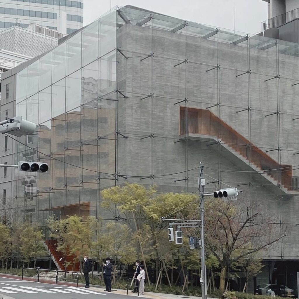
This building is covered with glass, which is quite unusual for Hiroshi Naito’s work.
The client did not offer any specific purpose or intended use of this building.
“The functions will be considered according to what has been done, so please design as you like.” That was their request.
Naito understood their thoughts and worked on this project to the best of his ability.
The glass is used like a skin encasing a concrete box.
Natural light is the main theme of this building. The first floor has light coming from the sides, while on the upper floors it comes from above just like The Pantheon in Rome, which makes them completely different impressions.
As the first floor has almost no lighting, you may feel like being in a cave in the middle of the city. The natural light coming from the sides creates shadows on the walls, pillars, ceiling, and floor, making the impression of something like “the light of the primeval.”
The pillars have a distinctive presence. Real cedar molding flasks are used for the formwork of these pillars.
Only skilled formwork carpenters can create a curved surface like the HP shell (hyperbolic paraboloid shell).
The joints are also perfectly aligned.
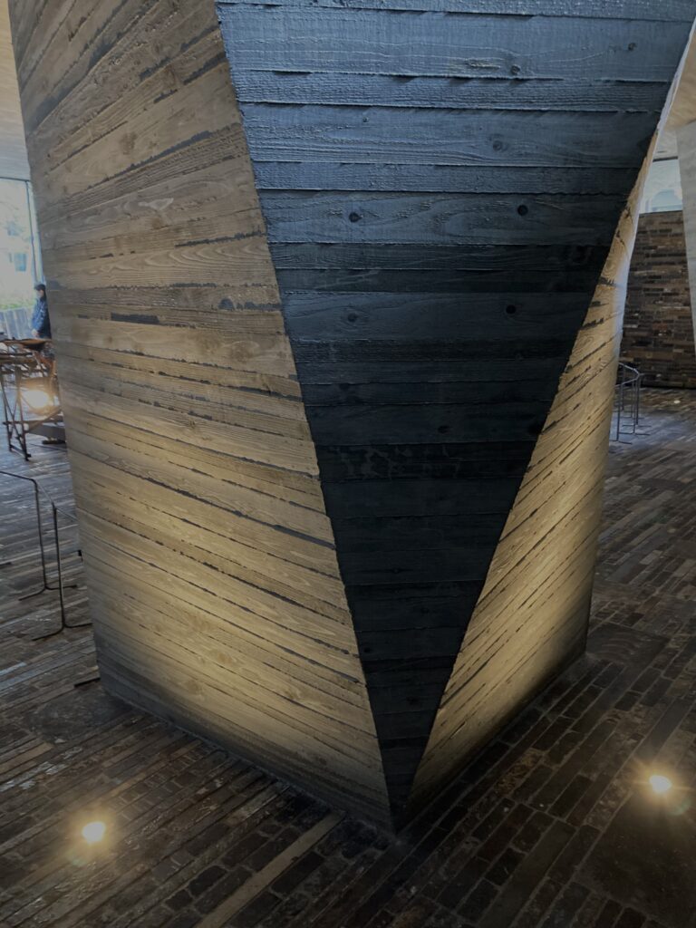
The ceiling has no lights at all, and natural light from the outside makes the pillars, ceiling, walls, and floor show various expressions. This is quite impressive.
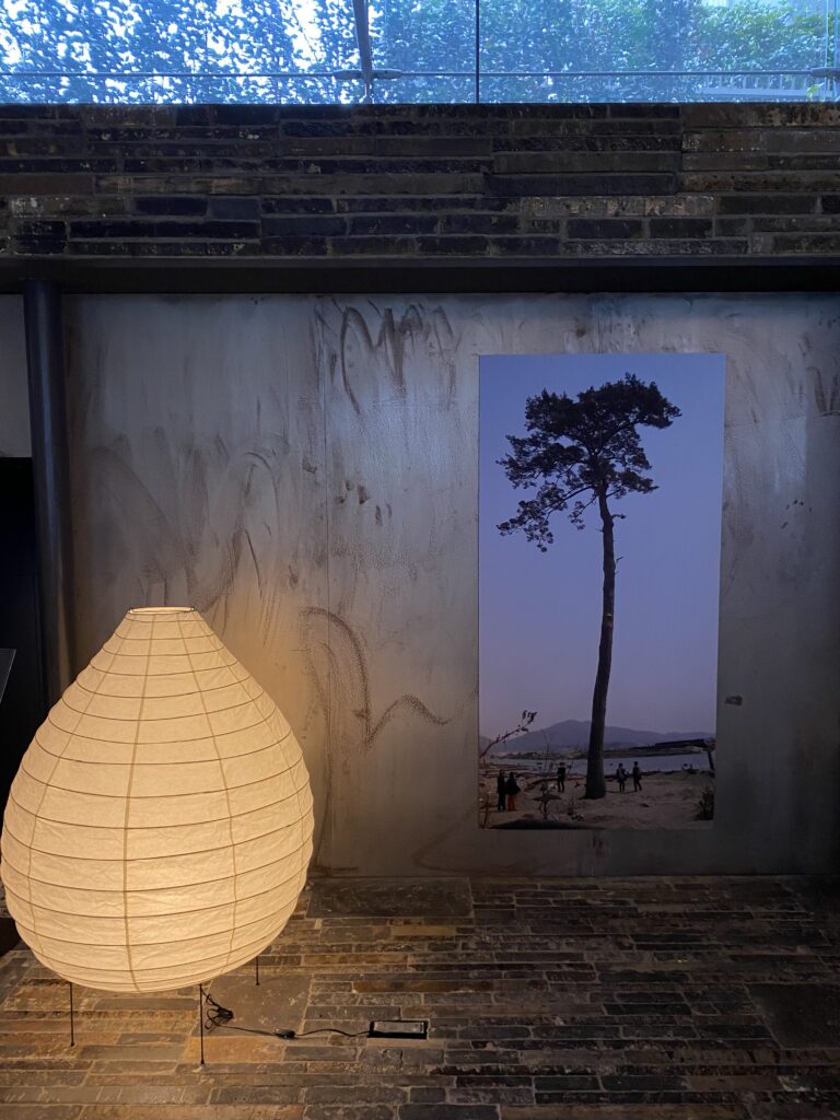
One of the few lights placed on the first floor was a lantern, probably a work of Isamu Noguchi. Its Japanese design matches this space.
When I saw this lighting, I was reminded of the same lanterns in the Sky House designed by Kiyonori Kikutake, Naito’s mentor. I remember that the Sky House did not have ceiling lighting either. Also, the shape of the pillars on the first floor reminded me of the HP shell wall of the Izumo Grand Shrine Cho-no-ya also designed by Kikutake.
On the contrary, the upper floor is a bright and exquisite space with divine natural light coming down from the top light.
The contrast between the bright and exquisite above-ground floors and the dark and Jomon-like first floor is interesting.

Another interesting point about its composition is that there are basically no windows on the second floor or above, while the exterior walls are covered with glass screens. Therefore, natural light comes in only from the top lights. Such a thoroughness.

The use of shelving from the firing kiln of the Sekishu tiles on the floor and walls of the first floor, and the use of molding formwork on the exposed concrete surface make this building look like a sister building of another Naito’s work, the Shimane Arts Center.
The entire space is filled with a sense of materiality and tension, such as the pillars, the concrete ceiling, and the flooring. The walls of the upper floor, the entrance doors, and the sliding doors are all made of solid wood.


When I visited there, there was an exhibition called “The Root of the Miracle Pinetree.”
from the big earthquake in Fukushima in 2011.

On the first floor, the root of the pine tree that survived the tsunami was placed in the center of the room. The dark space combined with the illusion of being underground made me feel as if I were looking at the root in the ground, touching its vital force.
I had the feeling that the trunk of the pine tree was growing in the atrium space from the second to the fifth floor, and its branches were growing through the top light. It looked as if this building was built for the root of this pine tree.
The technology behind the one and only
Let’s move on to its technical aspects. The second to fifth floors of this building are supported by four thick pillars on the first floor. I first thought it was a seismic isolation structure, but it is a general seismic resistant structure. The four thick pillars supporting the pilotis on the first floor are reinforced with super-dense reinforcing bars. Reversed beam structure was adopted to make the space look like a concrete box, and those beams are equipped with cables for pre-tensioning.
You can see the details on the drawings displayed on the first floor.
It is simple and has no additional products around the top light, and the staircase traverses the atrium space without a landing.
You can see Naito’s uncompromising detailing such as the handrails made of thin timber or the wood paneling on the interior walls.

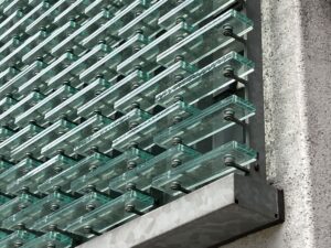
Naito’s other notable work, Mikimoto Ginza Main Store has a facade composed of glass pieces. His strong attention to materials and the technology that supports them is impressive. Hope you enjoy the next article as well.
Kioi Seido
3 Kioicho, Chiyoda-ku, Tokyo 102-0092
As of May 2023, general visits are not accepted.
For details please check their website.


