Cool Appearance, Great Challenge
Nicholas G. Hayek Center
Designed by Shigeru Ban
Author
Yasuo Nakamaru
Registered Architect and National Government Licensed Guide Interpreter.
Worked at an architectural firm for 38years and designed domestic works and overseas works in Japan, US, UK, China, etc.
Favorite Buildings: National Gallary of East Wing by I.M.Pei in the US, Kimbell Art Museum by L.Kahn in the US, 21st Century Museum of Contemporary Art by SANAA in Japan
Favorite Things: Playing bass guitar, Jazz Music
Along the main street of famous shopping area Ginza, most of the shops have a very narrow storefront and it all seems to look similar. In this article, we will introduce the most likely to be missed architecture in Ginza which uses minimal space creatively to overcome the technical challenges in a unique way.
In the previous blog, we focused on alleys inside the building. This time, let me introduce an interesting example of vertical alleys inside the building.
Vertical Alleys
Nicolas G. Hayek Center is the headquarters of the Swatch Group in Japan. The Swatch Group, based in Switzerland, is the largest watchmaker in the world. The company owns luxury brands such as Omega, Breguet, BLANCPAIN, and its name-brand Swatch. The company has a deep respect for craftsmanship, and this is the key that made this unique project possible.
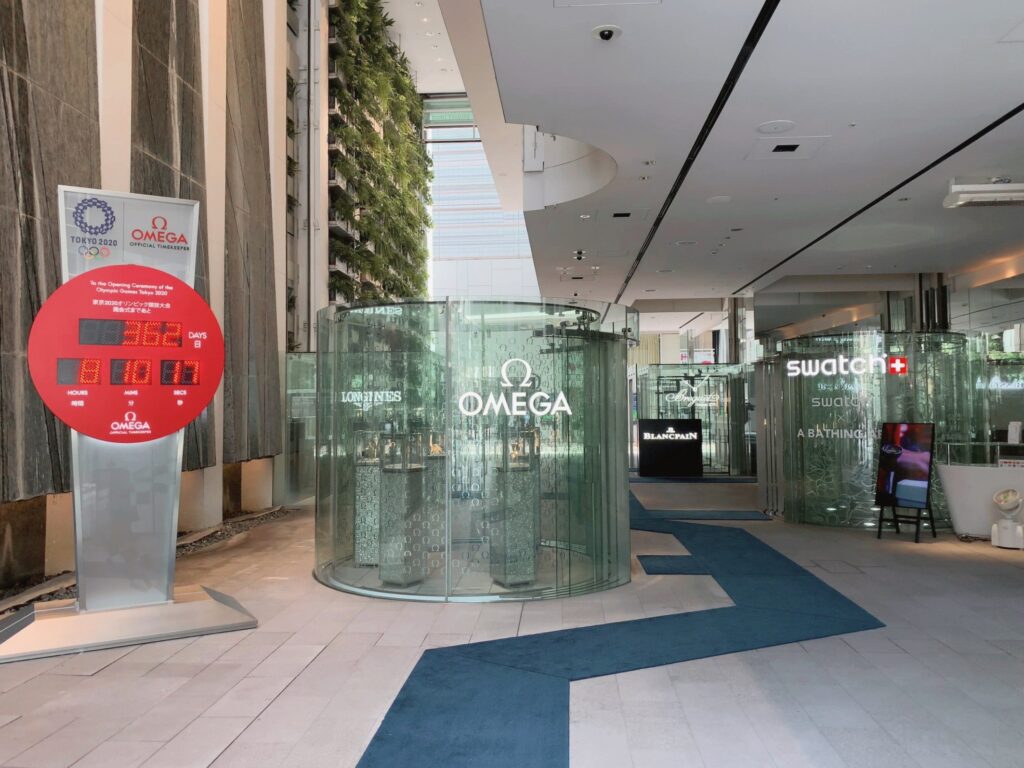
The building was planned to have several of its brand stores. Because of its limited frontage size, each shop is layered on each floor and individual elevators are installed for them. Those elevators function as vertical alleys going up to each store, and they are designed as showcases of each brand. They look like several small watch shops lining the ground floor.
This open-air ground floor leads you from the main street to the back street. However, this bypath of the ground floor is Ban’s original idea, not included in the competition requirements.
When applying for an architecture competition, “problem-solving” is a standard approach. But on the contrary, Ban proposed “problem making” for this project. Ban was confident that the owner would understand this paradoxical approach, and he turned out to be right.
However, it was not so easy to put public space and bypath on the ground floor of one of the most expensive land spaces in the world.
It was necessary to place an entrance to the underground parking lot on the backside of the building, which would occupy a large space of its frontage. To solve this problem and keep the space for bypath, Ban put special elevator for vehicles which comes up and down just like a rising stage in a theater. It actually looks like a sunken stage in a theater.

There are other examples like this bypath of the ground floor in Tokyo. Kinokuniya bookstore in Shinjuku, designed by Kunio Maekawa,famous Japanese architect, has a bypath on the ground floor connected to the back street. Also, in the former Marunouchi Building and the former Shin Marunouchi Building located near Tokyo station, there were crossroad pathways as a shortcut to other areas.
Vertical Green Space
This building has a greenery wall inside, which is quite unusual in Ginza.
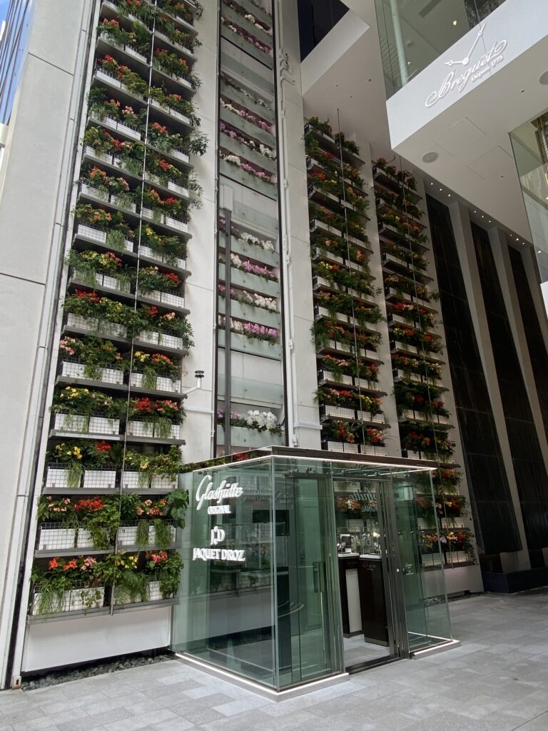
The 52 plant shelves from the 1st to the 13th floor cover the entire wall, offering an oasis in the city.
Greening inside a building requires thorough preparation, as it is not an ideal place for plants. Therefore, Ban spent 1 year finding the ideal environment for the plantation, including lighting, watering, airiness, and planting pattern. This space with a greenery wall and streaming water is a relaxing place, especially on hot summer days. In this building, alleys and gardens are all vertical.
This indoor greenery reminds me of Kevin Roche’s Ford Foundation Building in New York. There is an atrium in the building, open to the public.
Technical Challenges
Ban is famous for his technological challenge in his works. And, according to his own words, he is still searching to evolve his ideas.
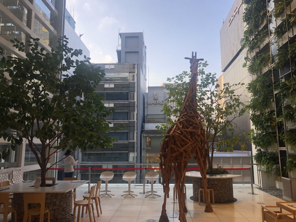
On the façade, large glass shutters are installed on each floor, which can be fully opened to get air from outside.
Glass shutters are also used for GC Nagoya Office or for residences designed by Ban. But in this building, every floor, from the 1st to the 13th, is fully covered by them.
The size of each shutter is 8m wide x 1m high, and it weighs 600 kg. There are 49 pieces of glass shutters all together, so the total weight is 30t, equivalent to 20 motorcars.
There is a carefree-looking giraffe object standing in the semi-open space.
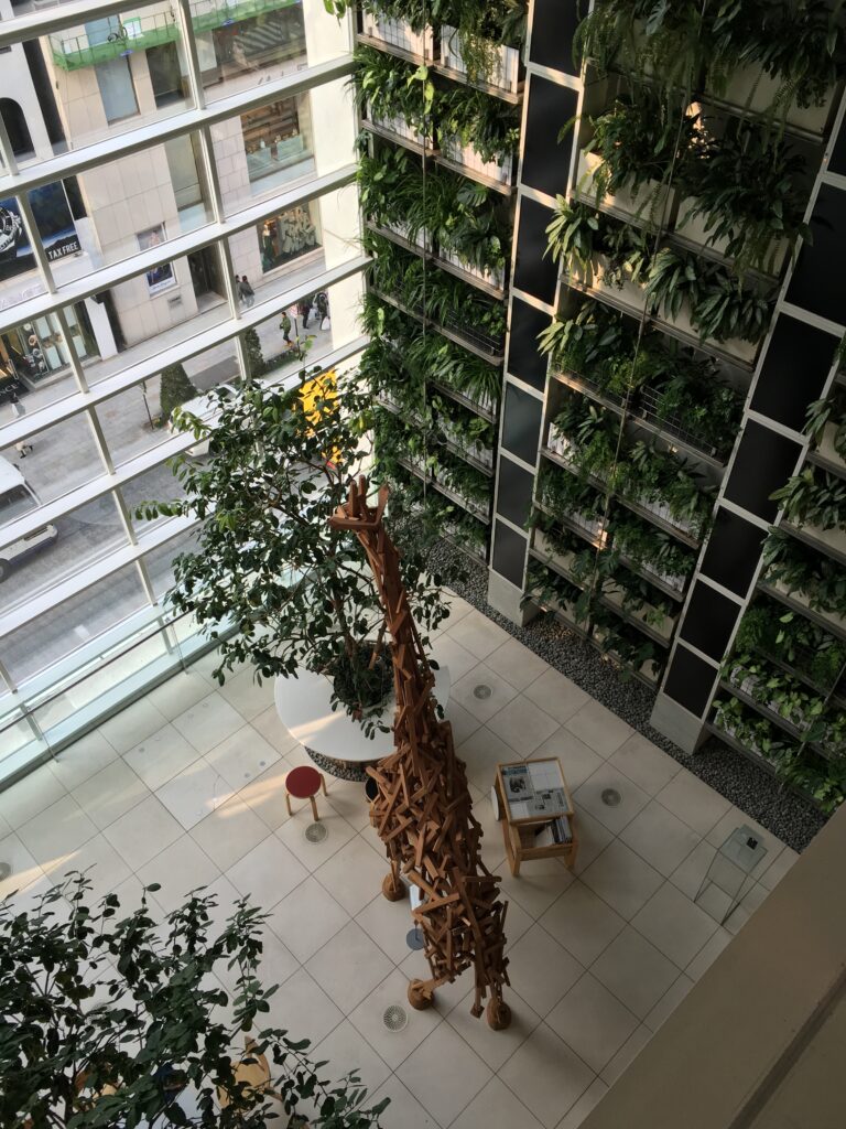
The most notable feature of this building is the structural idea which makes it possible to construct this slender shape.
The seismic control structure called “SMD; Self-Mass-Damper” is used in this building. Usually, for a standard seismic control structure, a large iron block is set on the roof. This building, however, utilizes each floor as an element of weight for seismic control structure. In addition, the height of dumper devices is only 600mm in order to be installed within the steel beams. This SMD is so effective that reduces 35 % of seismic force. The idea was inspired by a pendulum clock, which was proposed in his original competition plan.
The top floor has a unique lattice structure made of steel flat bars, which he later applies to his works such as Centre Pompidou-Metz in France.
So this building is full of these advanced technologies.
Owner’s project organization
I found an interesting point in its construction contract.
For the glass shutters and the elevators which are both important elements for this project, the owner chose to prepare separate and direct contracts from other construction works.
Usually, whole construction works are signed by one contract with a general contractor.
the owner may have preferred direct supervision for development and cost control for these two works.
As the owner understood the importance of craftsmanship they use their in-house project manager to deal with this unique building.
It may sound surprising, but Ban has learned so much from the works of Finish architect Alvar Aalto, such as the use of materials, the relation between context and architecture. Furthermore, Ban’s iconic use of paper tubes is also related to Aalto. For Aalto’s exhibition of 1986 in Japan, Ban took charge of interior design. On the limited budget for the exhibition, he first used paper tubes wrapped in fabric found in his office.
Ban is well-known for his volunteer work at the time of the disaster, building shelters with paper tubes in damaged areas.
He first provided emergency shelter in Rwanda, Africa during the civil war of 1996.
And the next year, he built a temporary meeting place called Paper Dome in Kobe after the Kansai earthquake, and in 2011 rebuilt the quake-stricken church using the paper tube in New Zealand.
According to his books, his offer was not always welcome or accepted at the time of disaster. It requires firm international networks to handle urgent and worldwide issues.
He never seems to get discouraged under any circumstances, and that makes him more attractive.
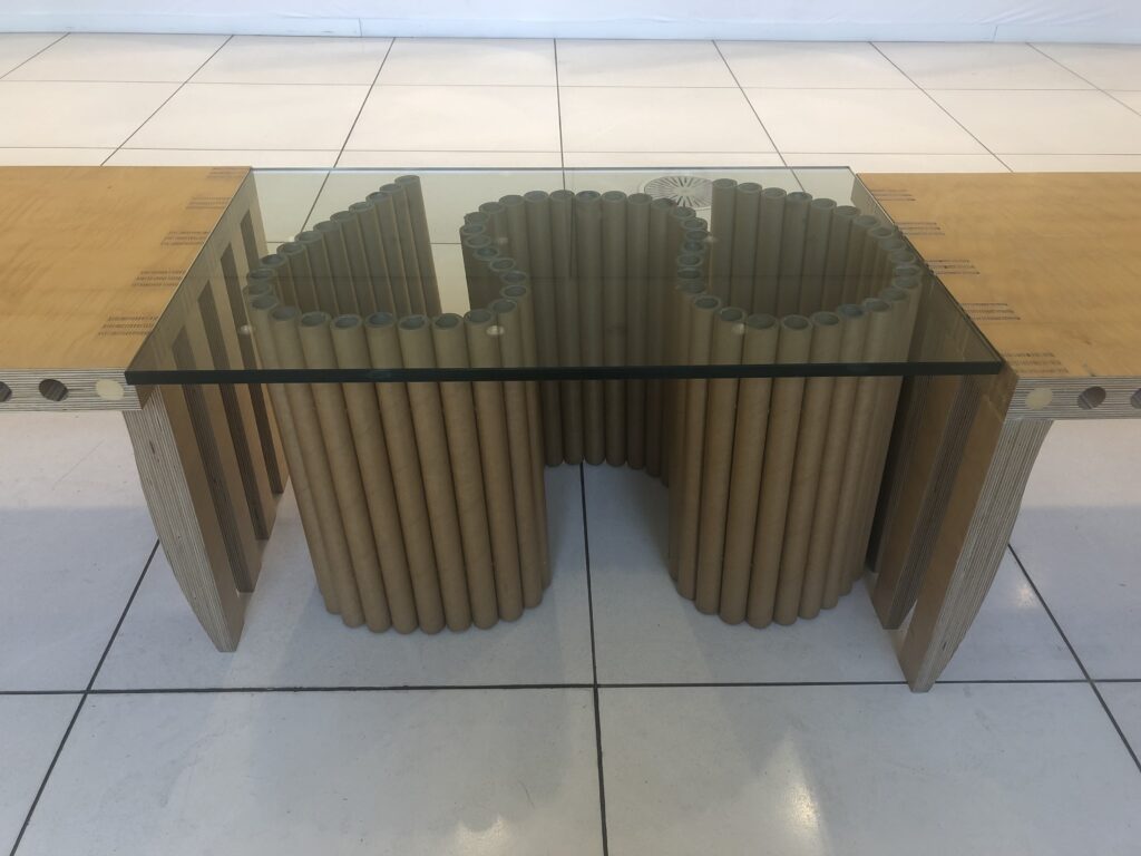
In this part, I have focused on the building with architecturally interesting alleys, reflecting the characteristics of Ginza.
There will be more buildings with the Ginza-ness coming up in the future.
Nicholas G. Hayek Center
〒104-8188 Nicolas G. Hayek Center,
7-9-18, Ginza, Chuo-ku, Tokyo
https://swatchgroup.jp


