Harmony in Design: A Glimpse into Junya Ishigami's Architectural Innovation
"KAIT Plaza"
日本語記事はこちら

I recently visited a creation by the architect Junya Ishigami, who, in recent years, has been making a mark with his extraordinary design sensibility, completing projects like the restaurant and house known as “Cave Restaurant” in Ube, Yamaguchi Prefecture.
He has captured attention with his unique style of architecture, which includes not only buildings but also nature and landscapes, without being confined by preconceived notions.
Proceed straight through the main gate of the Kanagawa Institute of Technology’s campus, and you will see a low white structure on your left. This is the KAIT Plaza that I am visiting this time.
It is standing next to the KAIT Workshop which is a laboratory and exhibition facility at Kanagawa Institute of Technology, which is his debut work in 2008.
About me

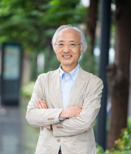
Yasuo Nakamaru
Registered Architect and National Government Licensed Guide Interpreter.
Worked at an architectural firm for 38years and designed domestic works and overseas works in Japan, US, UK, China, etc.
Favorite Buildings: National Gallary of East Wing by I.M.Pei in the US, Kimbell Art Museum by L.Kahn in the US, 21st Century Museum of Contemporary Art by SANAA in Japan
Favorite Things: Playing bass guitar, Jazz Music
Approaching from the left, the building was lower than imagined. I walked around the perimeter before entering, whereupon a different dimension awaits.
1. Feeling Architecture
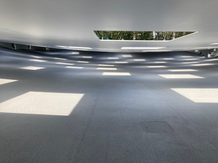
Upon entry, a gentle slope descends to the center, like a ceramic mortar. The ceiling (or rather, the roof) features 59 variously sized square openings.
There are elongated openings in the outer wall. I paused for a moment to feel the space. A pleasant breeze and sunlight pass through it.
Once you’re here, I want you to first feel this unique place physically.
Is this place indoors or outdoors?
It was a totally new experience. There is no glass fitted into the ceiling openings, so sunlight, wind, and even rain pass directly through.
The sunlight that hits the floor casts a square shadow. You can glimpse the sky through the skylights, and when it rains, it pours down in square pillars of water!
Nature, sunlight, rain, greenery, even insects enter freely into the interior, and you can keenly feel that this place is a section of nature carved out by thin roofs and walls.
I visited just after a rain shower, and drops were falling like a bamboo blind from the roof openings. The raindrops fell drop by drop into the lowest part of the floor, sounding like a Suikinkutsu (Japanese water harp).
This place is perfect for feeling the changing seasons.
2. Architect's Intent
The designer wanted to create a climate within the building and invite in the weather. By connecting 12mm-thick steel plates, he created a beautiful and unique plaza space reminiscent of the Piazza del Campo in Siena, Italy.
The phrase “architecture integrated with nature” seems cliched here. Rather than creating architecture, it is a part of the landscape, akin to “terrain architecture” or “stratum architecture.”
From a macro perspective, the earth is a large convex curve, while this plaza can be described as a large concave curve cut out from the site.

3. Underlying Technology
Another perspective to consider is the technology enabling this architecture. In terms of specifications, 12mm-thick steel plates form the primary structure, with a layer of permeable asphalt 30mm on top.
The weight of the steel plates on the ceiling part is approximately 580 tons. The peripheral walls and their supporting foundation consist of 83 piles, with 54 earth anchors.
The ceiling height ranges from a relatively low 2.2m to 2.8m. The space stretches leisurely about 82m north to south and about 55m east to west. Due to the low ceiling height, the openings in the ceiling feel even more pronounced.
The floor has a height difference of 5m, forming a mortar shape toward the center. The floor is covered with permeable asphalt, which was dry even immediately after a rain shower.
The structural engineer is Jun Sato. This work continues the flow from the collaborative work “Table,” which measures 9.5m in length, 2.6m in width, and 1.1m in height, with a thickness of just 3mm.
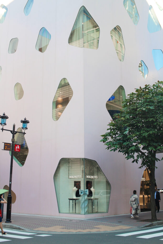
The steel plate processing technology reminds one of Toyo Ito’s MIKIMOTO 2 and Osamu Ishiyama’s Rias ark museum of art.

The cross-section of the square openings is very thin, much like a single sheet of steel.
To achieve this while maintaining architectural integrity, the surrounding walls act as anchors, pulling the surface that forms the roof. The roof forms a gentle concave surface. It’s also interesting that there are no right angles in the forming surface.
What is going on in Ishigami’s head?
Architecture conceived from the desire to be this way, taking a step back from concepts like site conditions and constraints. Taro Igarashi, architectural critic who had witnessed Ishigami’s working process, commented that he was surprised at how quickly Ishigami’s ideas were examined and materialized.
The space, supported by underlying technology, is simple with very few visible components. Still, it shows various aspects. It makes the experiencer feel rich – it is truly a building that embodies “Less is more.”
Thank you for reading until the end.
I hope to continue observing various architectures from the architect’s perspective.
KAIT Plaza (Kanagawa Institute of Technology)
1030 Shimoogino, Atsugi, Kanagawa 243-0203
Click here for the visit.

